
Problem
With the launch of the Payments product in November of 2022, there was a lot of cleanup to be done to improve the foundational user experience. To understand which areas of payment processing were causing the most pain, we collaborated with our staff researcher to implement a multi-pronged methodology, looking across multiple data points:
• Internal ratings on key P2P user journeys by EPD leaders
• Internal ratings on UX for new users and power users by Solutions Consultants
• 1:1 in-depth interviews with P2P end users (8 in total)
• Analysis and review of P2P customer support tickets
Example of internal rating of P2P User Journeys by EPD leaders
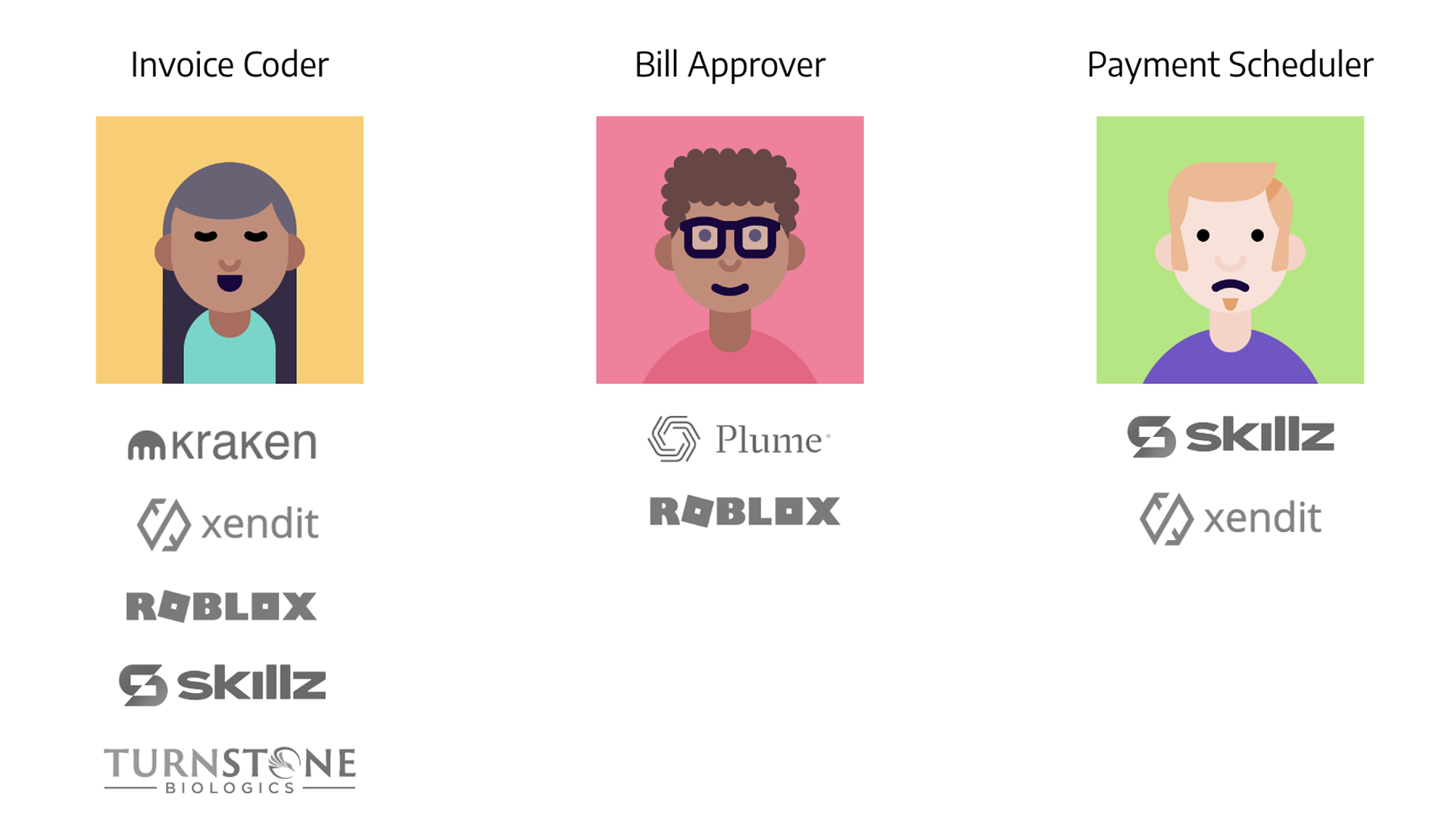
User research
We talked to three key personas during our user research who are involved in payment processing.
Invoice coder: takes the invoices sent from vendors and inputs the information before creating bills.
Bill approver: reviews the bills to check for accuracy and prevent fraud.
Payment scheduler: organizes and pays bills out to vendors promptly.
We found that invoice coding was rated the lowest on return to value. We learned that invoice coding and bill creation can take up to a day, when ideally it takes no longer than 10 minutes per bill. This compounds in cases when there is a large influx of invoices that need to be processed, especially at the end of the month.
“Slowdowns for invoice coding happen when we have to manually delete lines that have been incorrectly matched to PO lines. Or OCR is incorrect. We have to start from scratch.” (Participant 5)

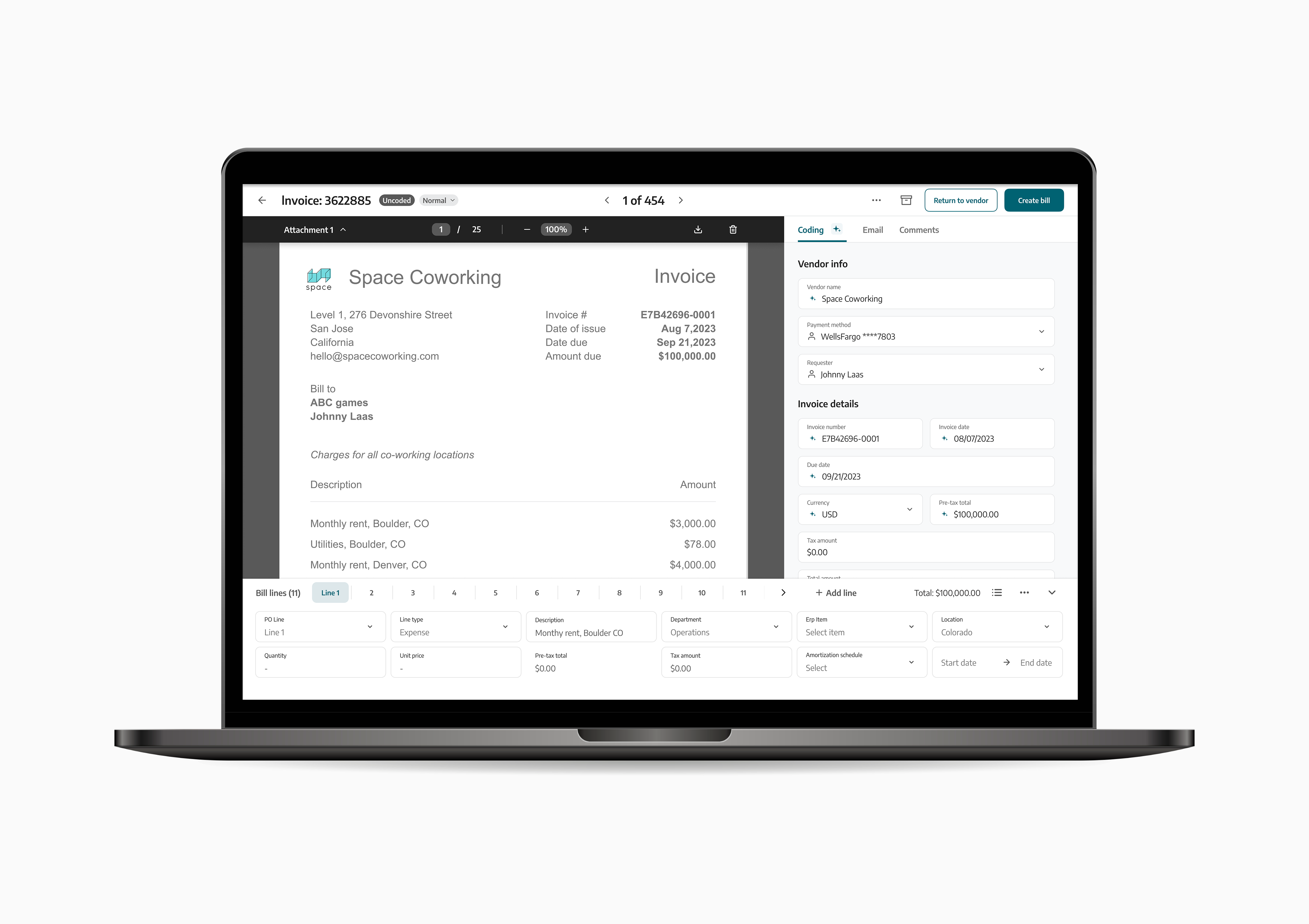
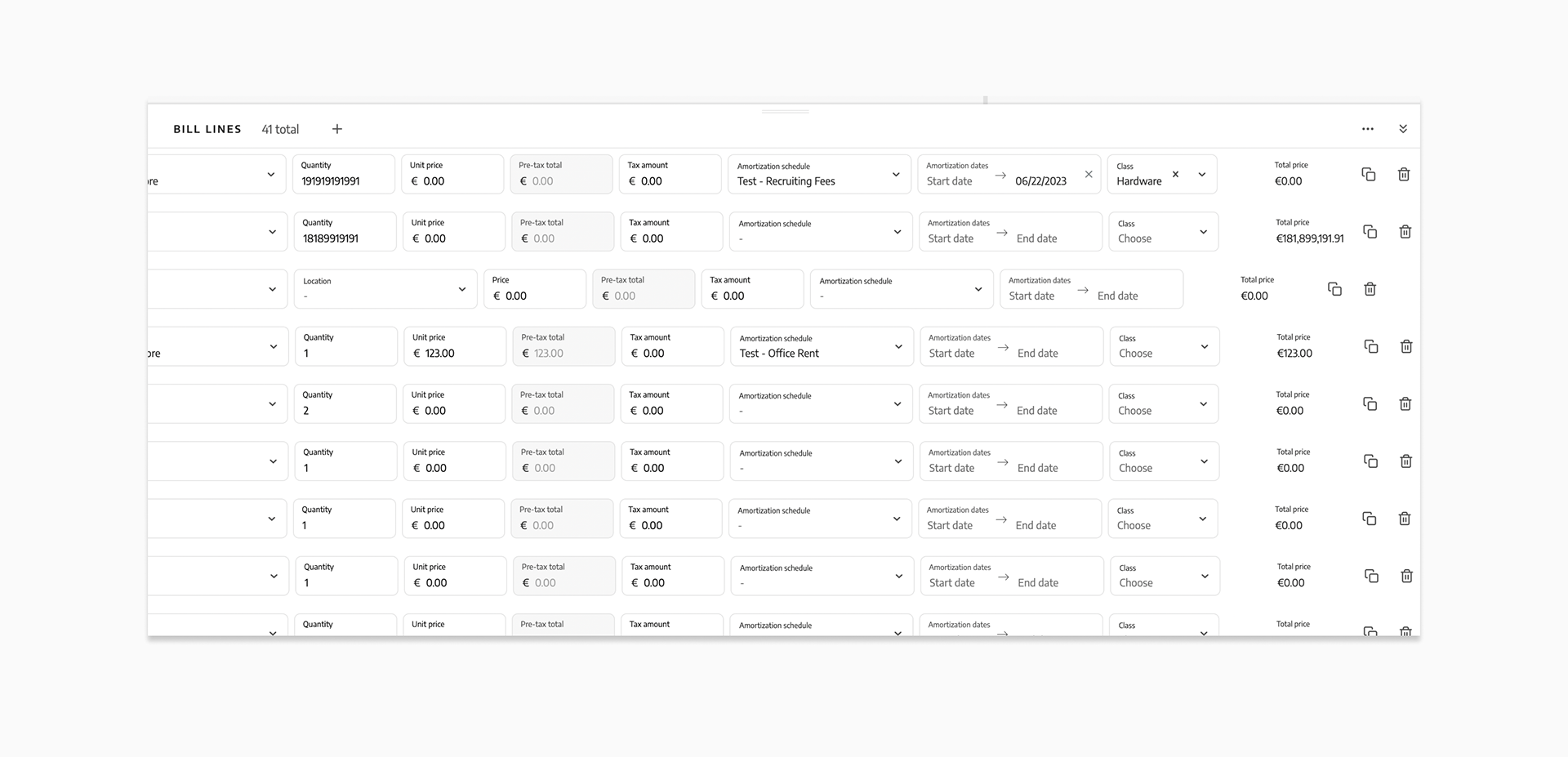
Existing bill line item tray UI
In terms of the UI, the bill line item tray was where the most problems were rooted. Some of the problems AP coders and approvers reported were:
•It's difficult to see everything at once, especially for complex invoices with many lines.
•The dragging behavior of the tray felt 'buggy.' When adjusted, it wouldn't stop in a predictable spot.
•When the tray was closed, there was no indication of how many lines were there.
•When a bill approver reviewed consecutive bills, they had to click every time to open and see the bill lines.
•When coding an invoice with many lines, the user couldn't see the total amount inputted for a given line.
Existing line item tray interactions
Concepts
With the findings from the research, we aligned as a x-functional team to fix UI bugs in the current tray experience. Issues with OCR and PO Match will be addressed in a later quarter, given the need for more engineering resources.
How might we increase information density to see multiple fields at once while also supporting legibility?
As the design lead, I wanted to dig deeper into the user's need for information density. Although the average bill has a max of 3 bill lines, the invoices that take the most time are the ones that have an atypical amount of lines. So to create the best bill line tray possible, perhaps we should cater to the extreme case to make the holistic coding experience better.
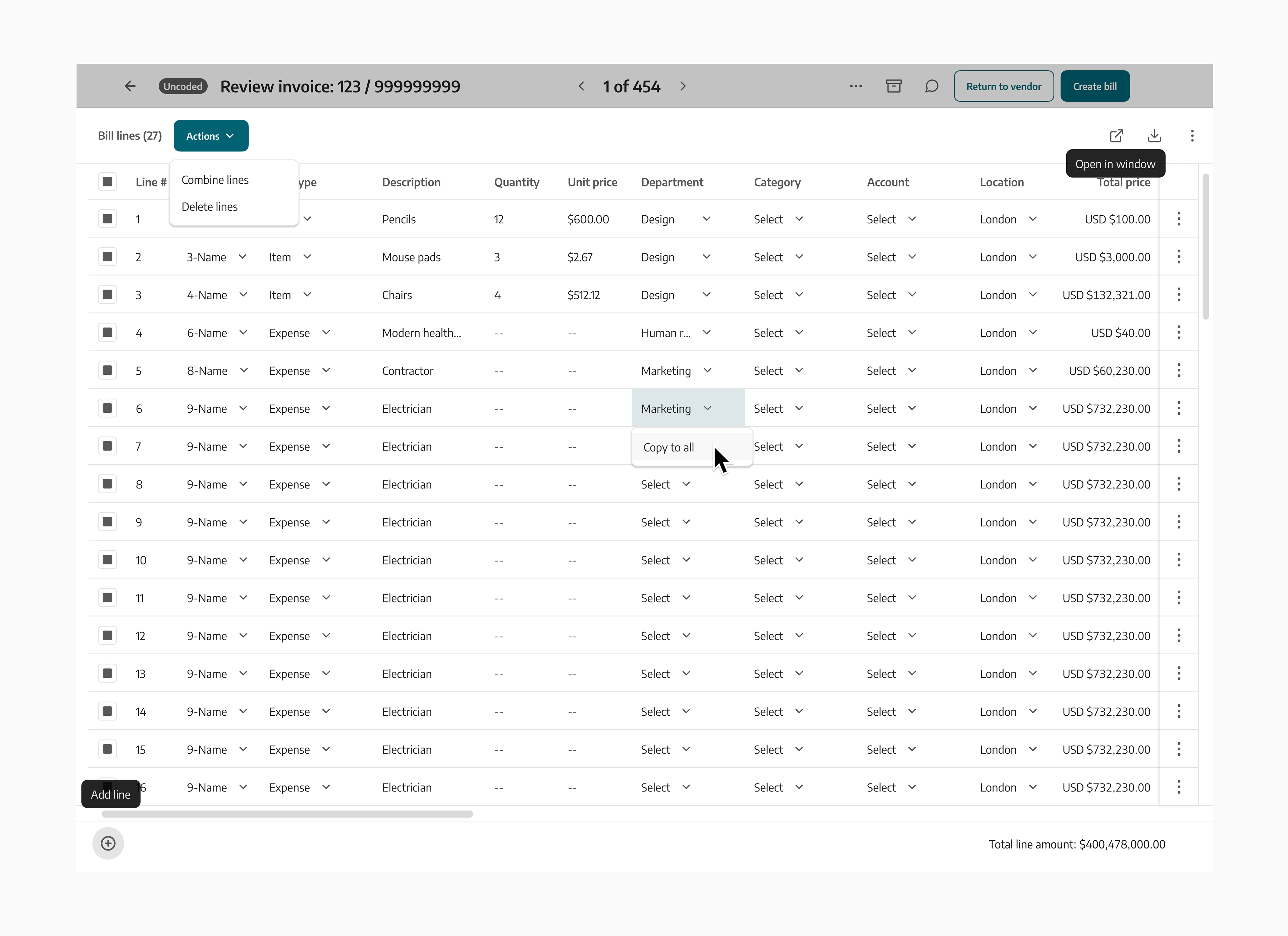
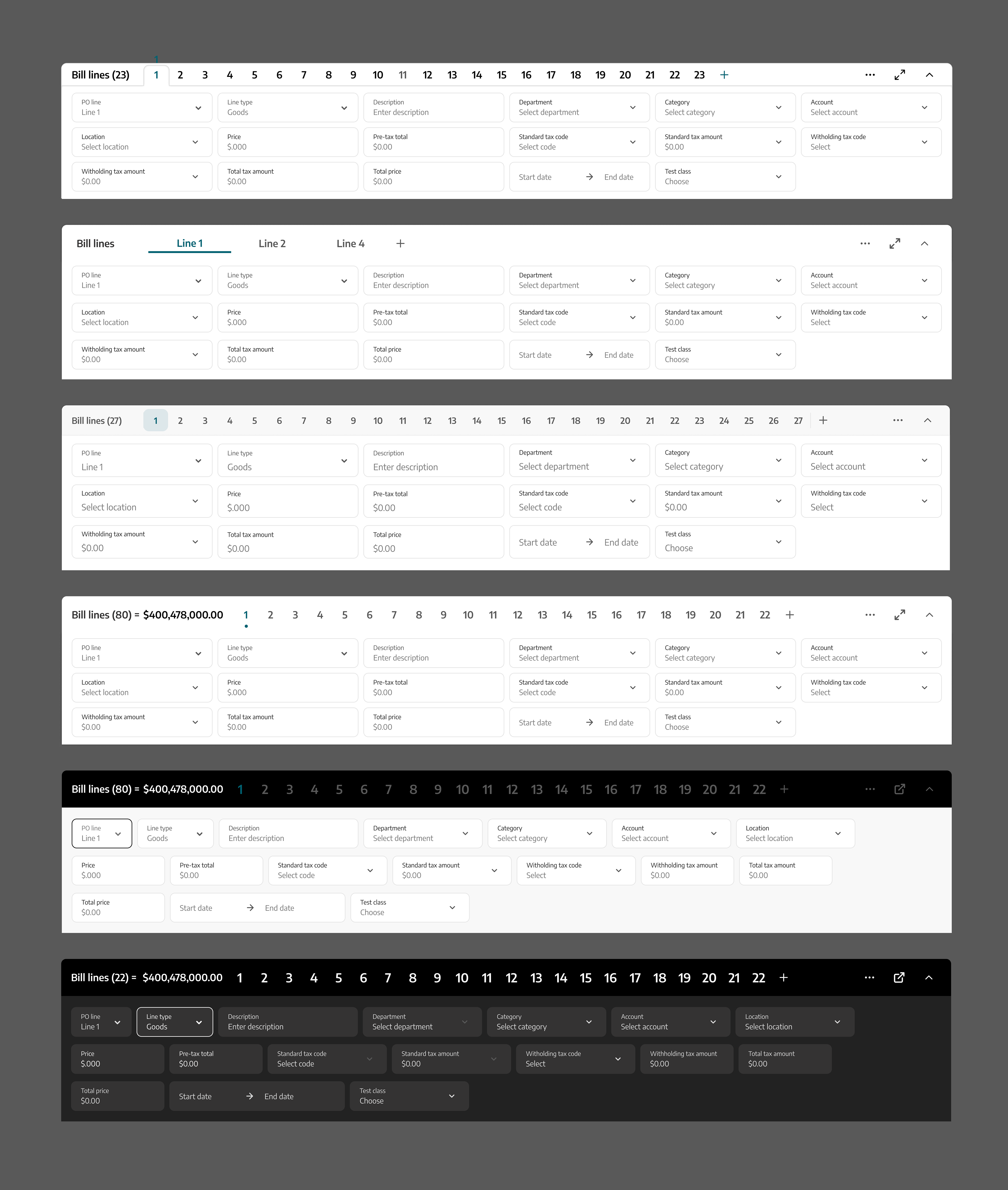
Exploration of a table approach to the line item tray with bulk actions
With this hypothesis, I designed a line item tray concept that took a 'table' approach. Given our customers were comfortable with the information density of spreadsheets, including the opportunity for bulk actions, it seemed like a viable option.
However, in reviews with the x-functional team, the consensus was to move forward with a conservative approach, given the lack of time for additional user research and hypothesis validation.
With this feedback, we moved the design forward with a focus on how to best improve the existing UI, with minor changes to the tray that would yield the biggest value to customers.
Detailed design
Misaligned fields when bill lines contain 'expense' and 'item' line types
With so much low-hanging fruit (i.e. obvious UI issues in the line item tray), I started to deconstruct the current tray into its basic parts, such as:
•Inconsistent field widths that result in misalignment and disorder
•Padding between lines
•Field height
•Tray height
•Field spacing
•Field type size
I tackled each component of the line item tray one by one. Tackling them separately allowed me to communicate micro-decisions and build alignment with stakeholders along the way.
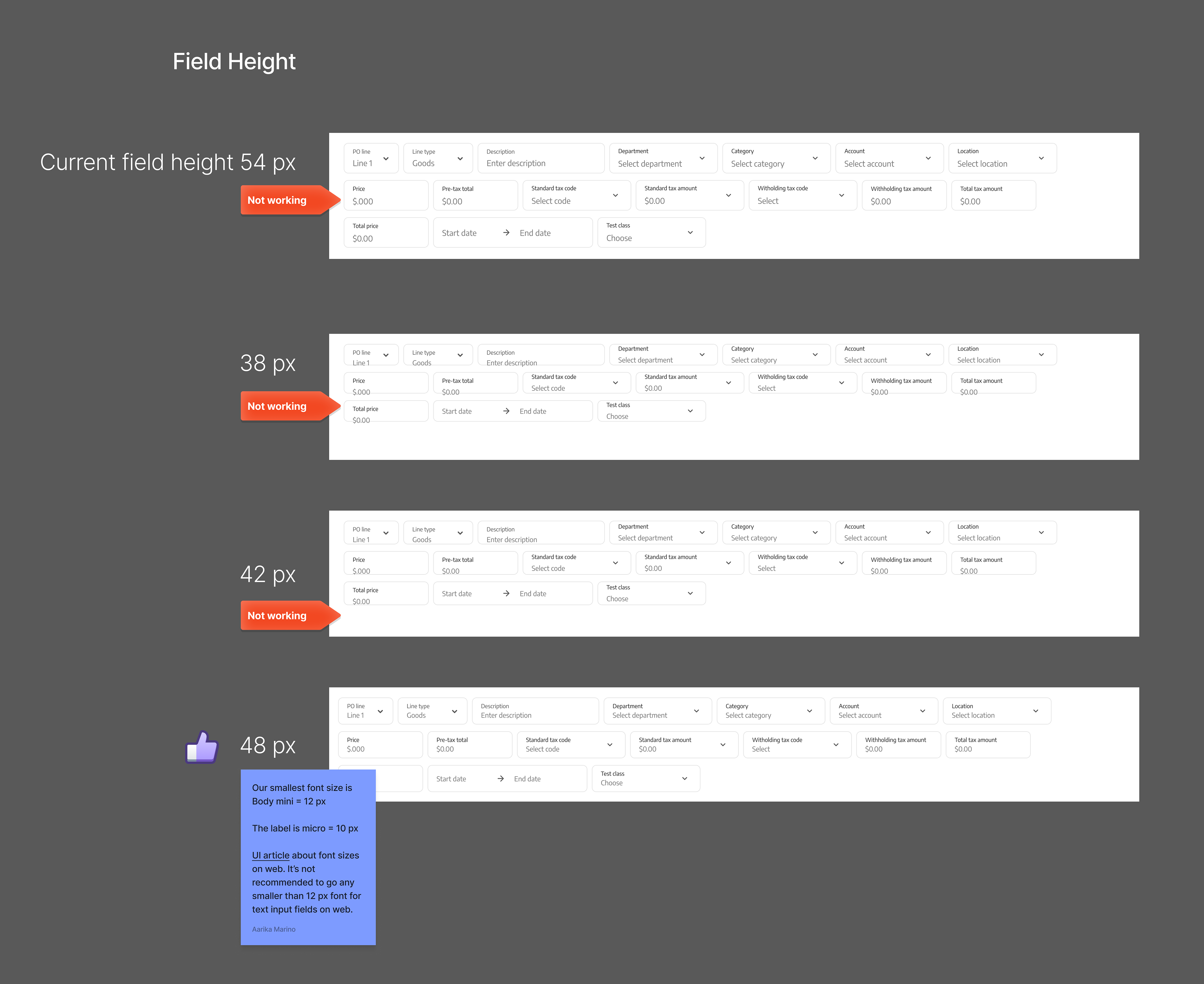
Example of 'Field height' exploration
How might we provide a familiar UI while also differentiating between our competitors in ease of use and innovation?

As I was tackling the deconstruction of the tray, I was sensitive to industry patterns for bill line coding. Given we heard from customers that there's a learning curve to understanding how to code invoices in Zip, I took into consideration familiar icons and the information hierarchy of the bill lines to provide a sense of familiarity while still providing a clean experience.
Iterations of the line item tray styling when the tray is open
Shipped designs
"The new Bill Line items tray looks soo much cleaner!!"
- Dataminr
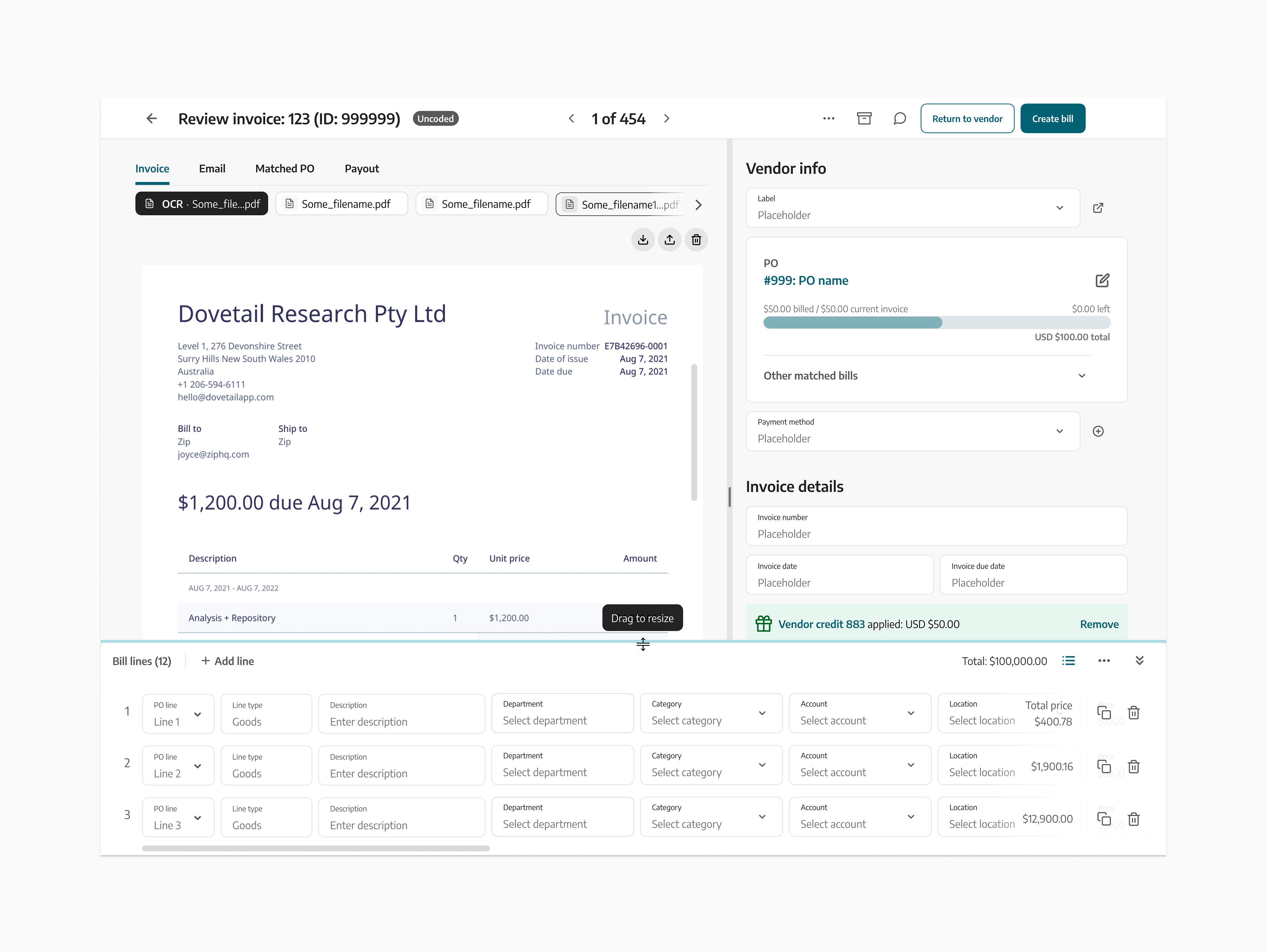
Hover state for resizing the tray
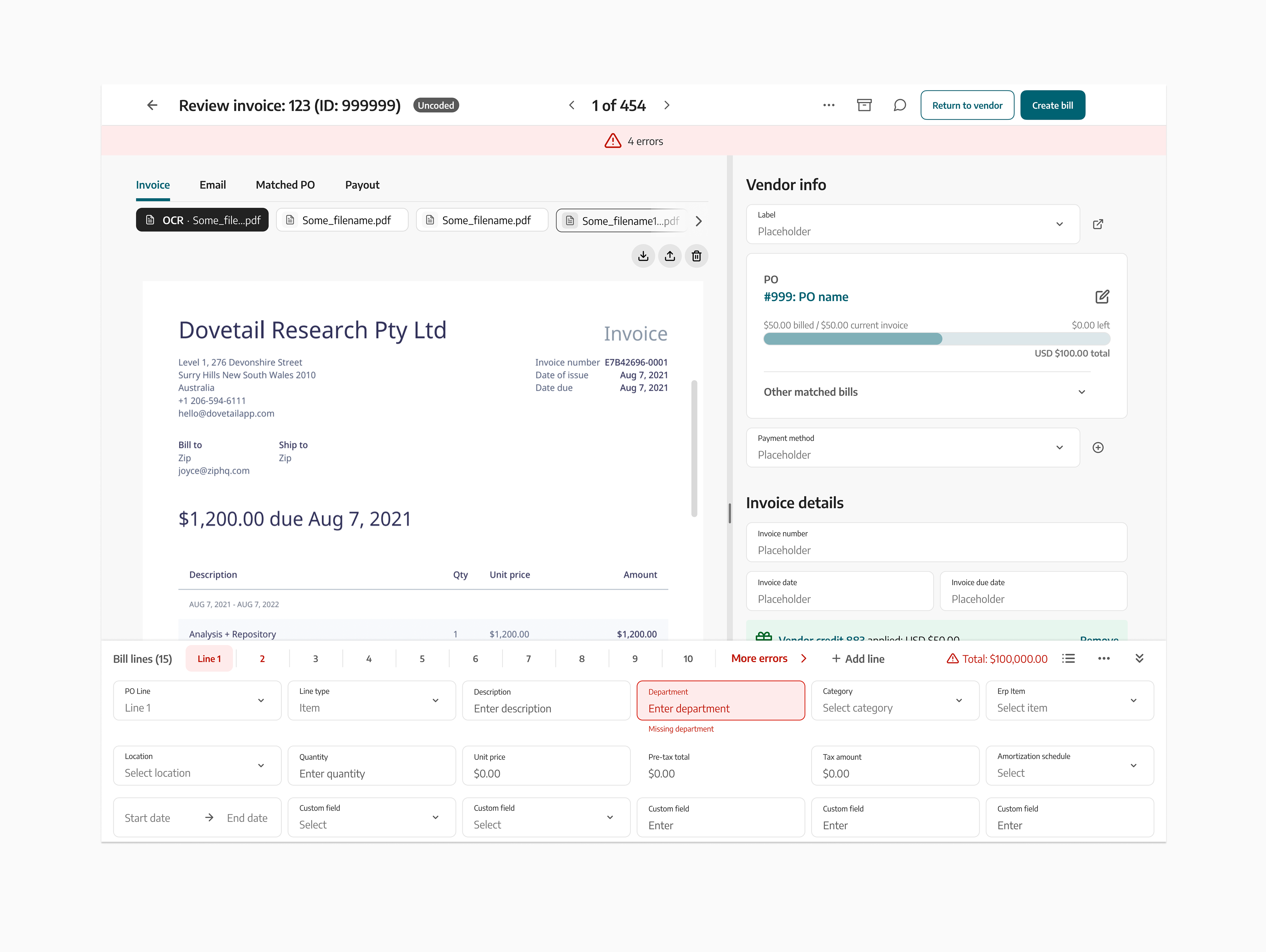
Better error messaging and handling when there are multiple errors
Project learnings and challenges
Pair design with engineering was paramount to ensuring the new line item tray drag interactions were performing as expected. And getting the max and min-height right for a variety of invoices varying from of 1 to 100 lines was also critical to test with real data.