
Problem
Parent burnout is prevalent in American society. Between work, family, and a million other obligations, parents today have a lot on their plate and are failing to maintain a healthy sense of wellbeing. According to an article published by Fast Company in 2021, parents reported the following:
•55% haven't been able to balance home and work life
•85% felt their wellbeing has declined
•89% felt their work/life balance was worsening
The Yohana app and service
To help solve the problem of parent burnout, we created the Yohana app and service to connect parents with an Assistant who can help with a myriad of common parent needs, such as:
•Home maintenance
•Planning family trips and activities
•Gift shopping and giving
•Scheduling appointments
•Kid care and education
•Researching products and services
Yohana is a B2C service, but it also has a B2B component. Assistants aren't just using Yelp or Google search to find the best service providers for a given job. Instead, they're using a vetted database of pros and businesses that Yohana knows will meet customer needs.

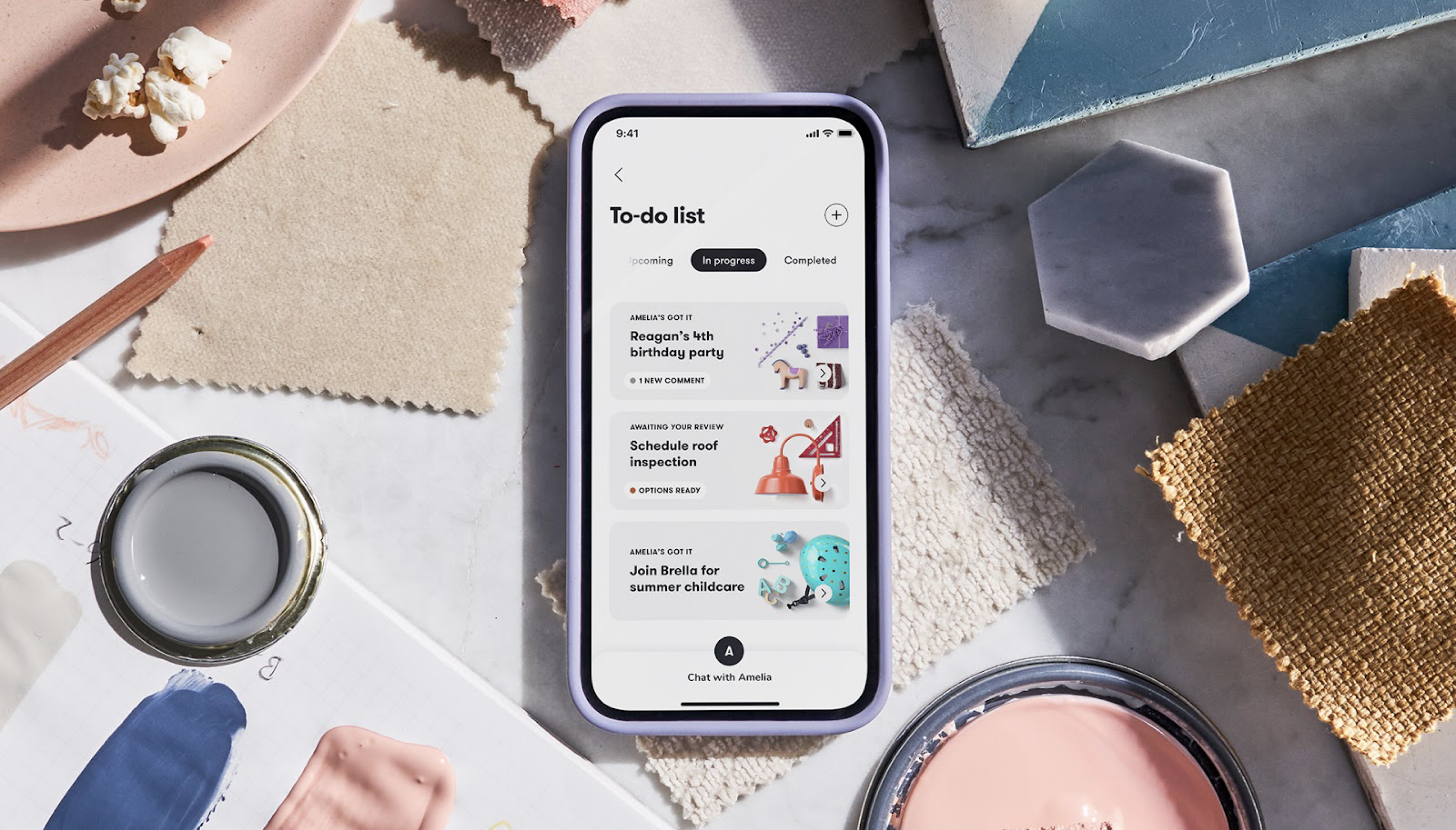
Parents simply open the app and use chat or create a new to-do. The Assistant accepts and carries the to-do through a lifecycle of scoping, researching, sharing proposals, and scheduling jobs.
Building a multi-platform experience
After our pubilic launch in September of 2021, the product team launched a CSAT survey to regularly collect feedback from our customers about their experience using Yohana.
Over the course of a month, we received consistent feedback that the mobile app was difficult to use, specifically, parents wanted access to a keyboard in order to type longer responses to their Assistant.
"I'm a much faster typer on my keyboard. I get tired trying to respond to my Assistant's messages." - CSAT customer feedback
"I like to make formal decisions on my laptop where I can easily compare options my Assistant sent to me. I browse informally on my phone but it's too hard looking at the options in individual browser tabs." - CSAT customer feedback
Opening any kind of Google document or spreadsheet my Assistant has shared with me is much easier on my computer vs the mobile app. - CSAT customer feedback
In order to meet this customer need, I led the design of the Yohana desktop experience. I worked with a team of engineers to translate our mobile app experience to web. My responsibilities included:
•Aligning x-functional stakeholders on project needs and scope
•Facilitating group reviews
•Creating design specs and leading engineering handoffs
•Working with QA to answer questions about feature functionality and ensure designs are implemented correctly
Scope
Given the 3-month deadline, it was important that design, engineering, and product were aligned on the expectations for launch with leadership. In our scoping conversations, we agreed that an MVP experience would entail basic feature parity/functionality with the mobile app. It was important that all data and information shared on either platform would be in sync.
It was also critical that we de-prioritize the mobile web experience to continue to promote users to download the native app and reduce design/eng time building specific components for mobile web.
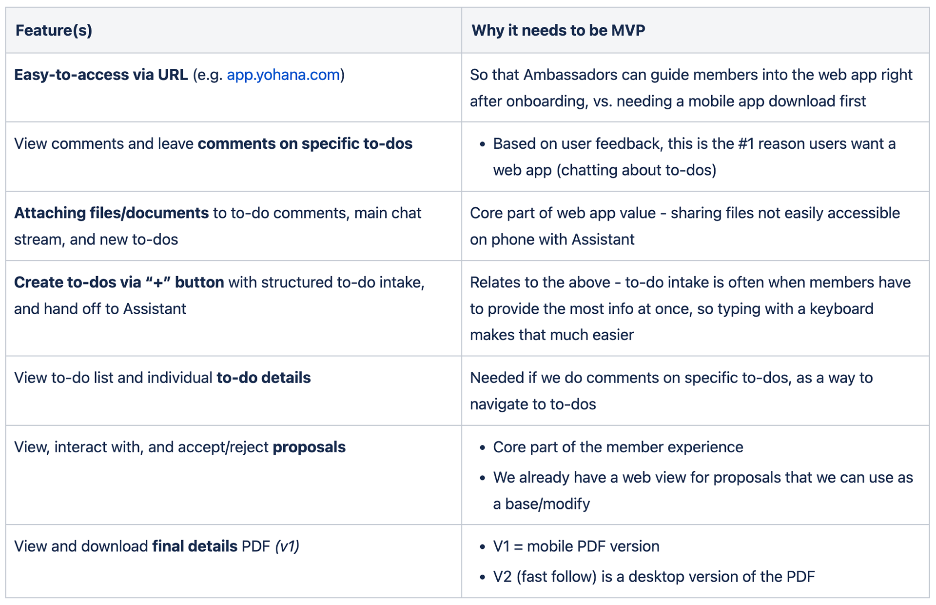
Feature scoping for MVP
Foundational design work
There wouldn't be any time for extensive design exploration or research. To help curb subjective decision-making, I conducted a few design exercises to ensure we'd have an informed approach before jumping into design specs. Those exercises included:
•An audit of consumer web experiences (what works/what doesn't)
•A proposed site map
•An interaction & navigation model
•A proposed web components list

Proposed site map

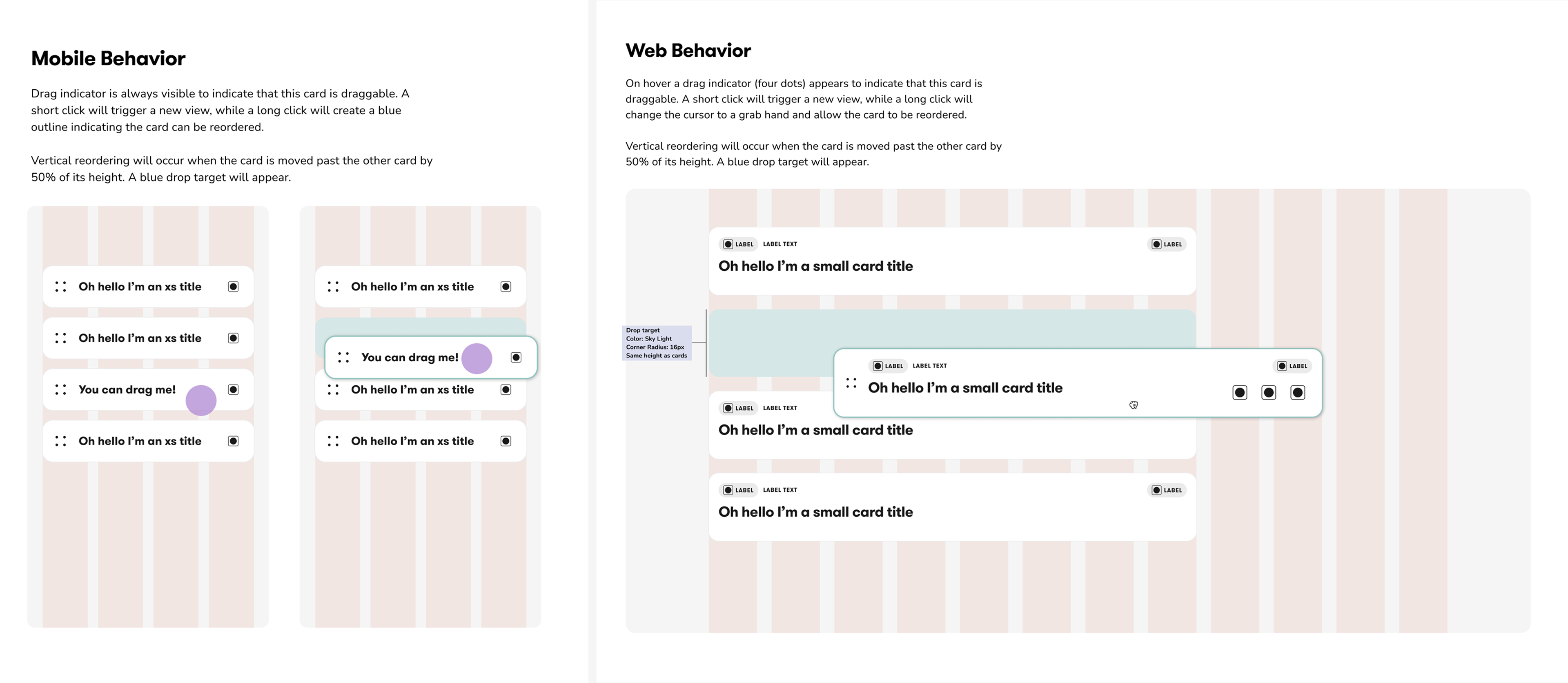
Interaction model
Detailed design
We went through multiple rounds of iteration on page layouts and functionality, starting with a direct translation of the app to web. However, this simplified layout didn't take advantage of the space or help with the multi-tasking that parents want to achieve in a native-web experience.
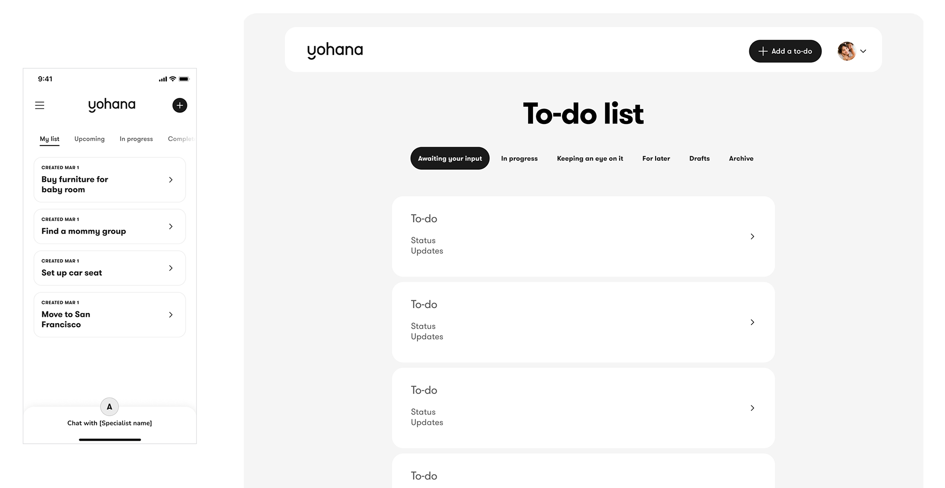
Direct translation of the app to native web

Experimenting with a grid view to take up more of the screen while also providing hover actions
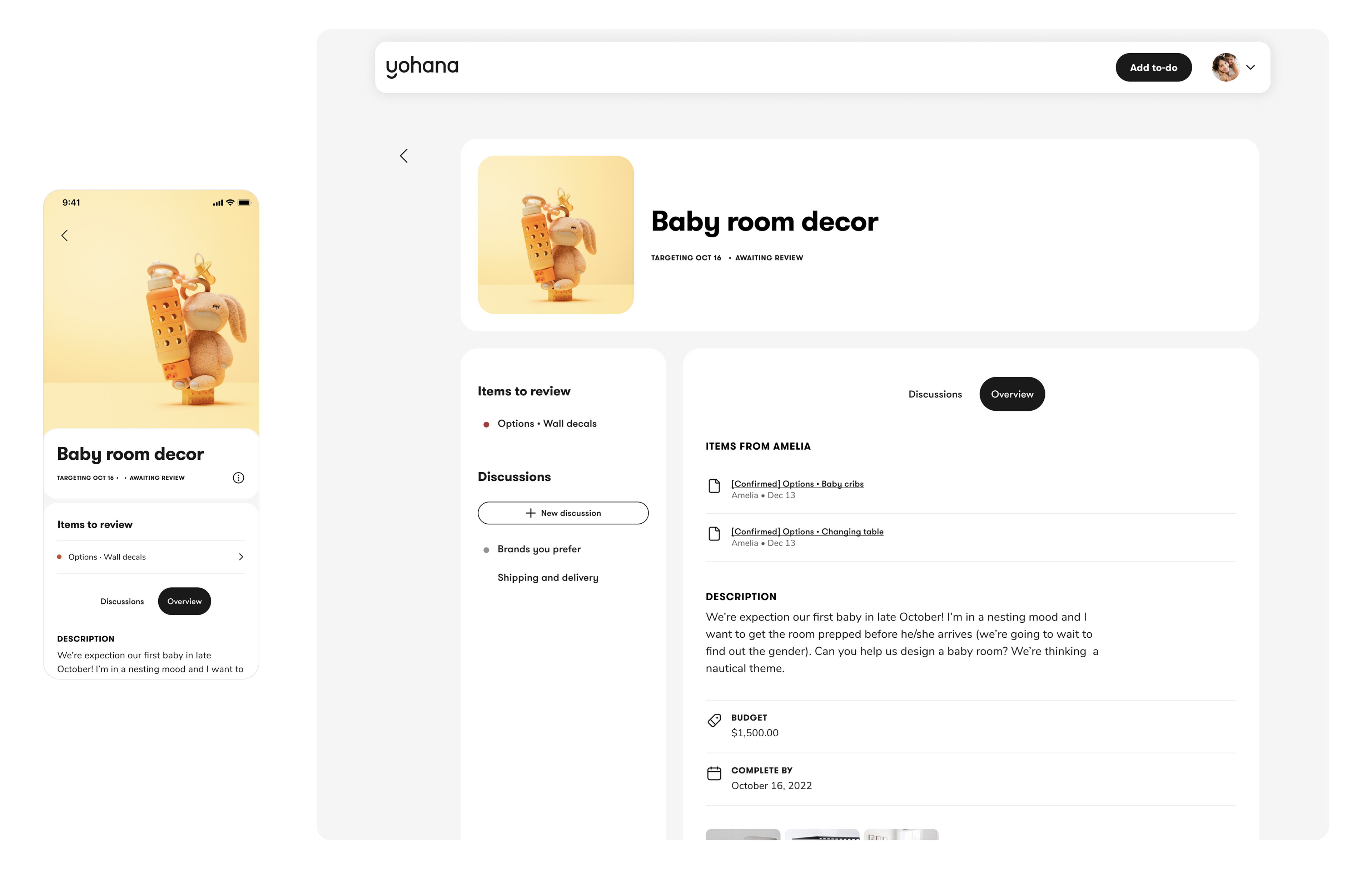
Detailed to-do views on mobile and web. Focusing on layouts that optimize for a native experience elevated the experience across platforms.
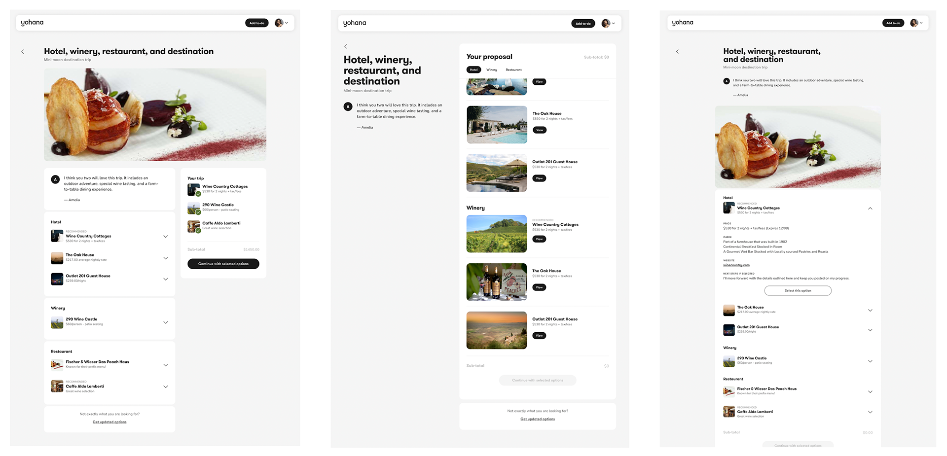
Layout options for 'Proposals' or the list of recommendations for a to-do that's curated by the Assistant.
While thinking through the page layouts, I was also working with our Design Systems lead to create interaction and web-ready component specs for engineering.
Implementation & testing
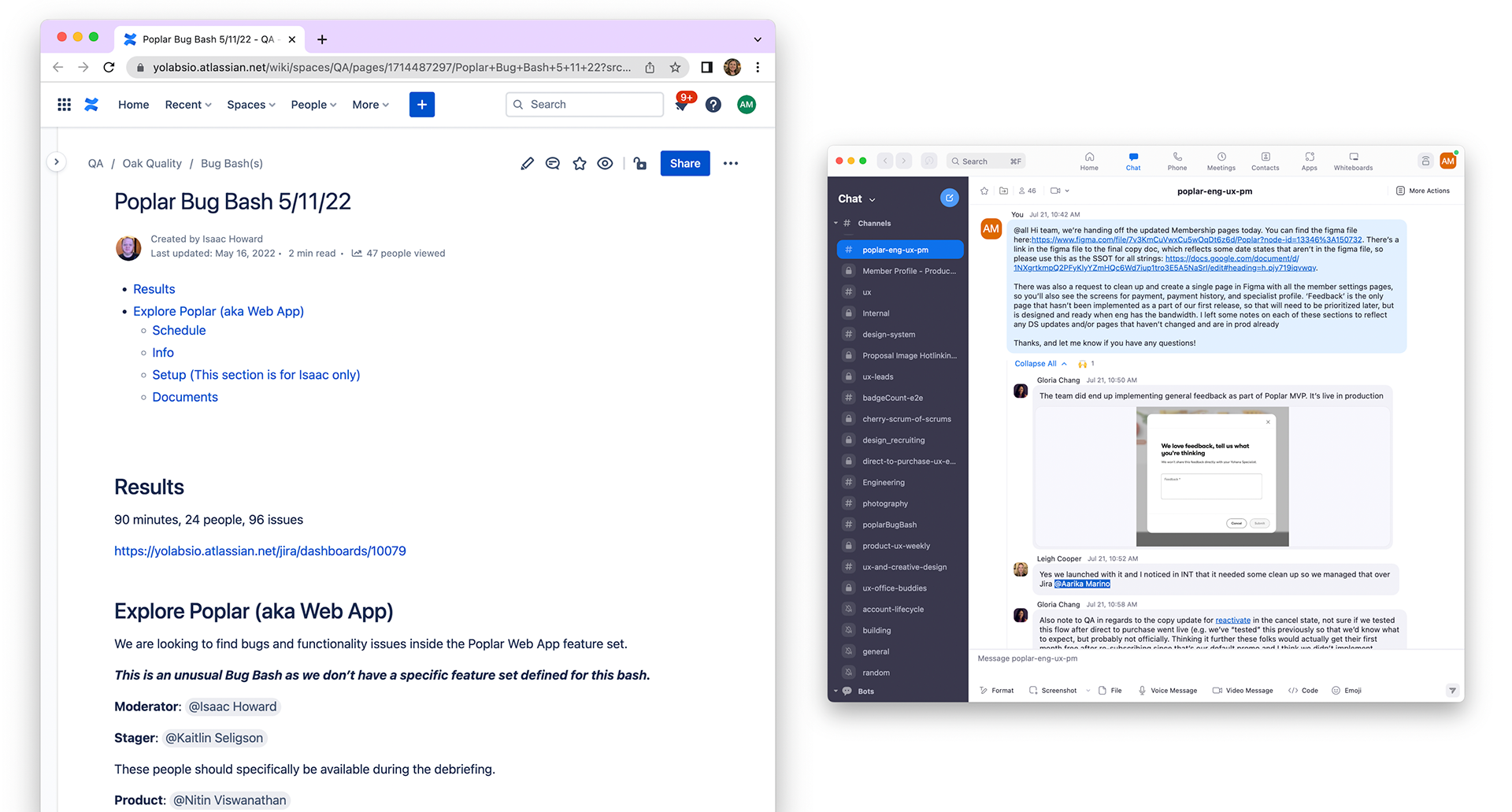
To ensure the web app was ready for launch, I collaborated with the QA team to run a group bug bash were we filed tickets (bugs and feature requests) into Jira to be triaged. We also created an internal channel after the bug bash to vet feature requests and ensure the product would be polished for launch.
Shipped product
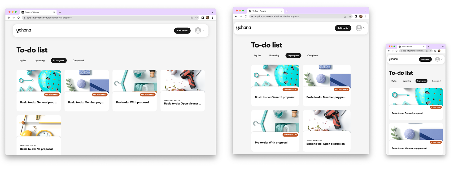
We launched the web app in early spring of 2022. Customers reported preferring the web design to mobile because it allowed them to see more at once and it was easier to respond to their assistants.
With the success of the MVP launch, it was important to me that we continued to track and monitor areas where usability could be improved. I created this set of proposed metrics to help us understand whether our design decisions were successful.
Fullstory was also used as an input to whether our design decisions optimized for user journeys, such as ease of access to proposals via quick actions on the project cards.

Metrics to track as shared with engineering for implementation
Project learnings and challenges
Designing an end-to-end product experience for web was extremely challenging in the time we had available. It was an incredible learning experience in coordination, communication, and speed. Below are some of my key takeaways from this project:
•1 hour mid-week reviews with engineering and backend services helped us review concepts early and flag potential issues before building out flows in code
•Creating a clear handoff schedule and not making that schedule dependent on completed design components helped us build iteratively and faster than in the past
•We were able to move faster as a web team vs. mobile because we weren't constrained by release cycles and app store approvals
•Keeping feature parity between web and mobile will need to be addressed, given the different development cycles and lack of engineering resources