
Problem
How do we take this new assessment technology and make it accessible and understandable to all runners? How might we educate runners, who have strict training plans, about when it’s time to take a break?
User research
In order to understand the interest in a fatigue assessment from runners, I reached out to our MapMyRun user base for feedback. I started with a simple survey that was distributed to a select number of MayMyRun users. Questions included details about their running habits and their interest in a 30-second fatigue assessment. Based on 1.6k responses, we found:
•56% of our audience run 10-20 miles per week
•60% run when fatigued
•32% are interested in a fatigue assessment
After the initial survey, I conducted in-person interviews with 10 local MapMyRun users. The runners had a range of weekly milage and experience. The interview was divided into two parts:
1. Understand how the runner develops habits, chooses their tools (i.e. running gear, apps) and sets their goals.
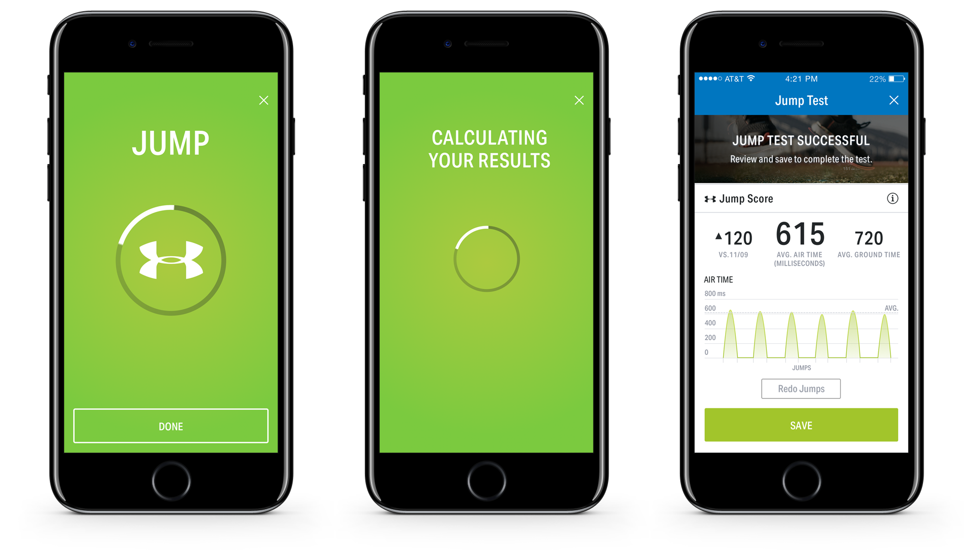
2. Simulate a mock Jump Test with runners via a video embedded in our mobile prototype and have them perform the jumps to see if they could do them correctly.

Based on the findings of the study, I socialized the learnings with the product, UX, and engineering teams. First, we'd need to find a way to host a video in the experience that demonstrated the jumps. It was very difficult for runners to perform the jumps without video and audio instruction. Second, the runners didn't like the positioning of the test as a 'warm up' since jumping isn't a typical movement for runners and seemed 'silly' as a warmup. And last, runners in the study were resistant to the idea of changing their planned workout if they test as ‘fatigued.’ However, they responded positively to research and science-backed evidence that taking an easier run or rest day would help them with longevity and managing fatigue over time.

UX iteration
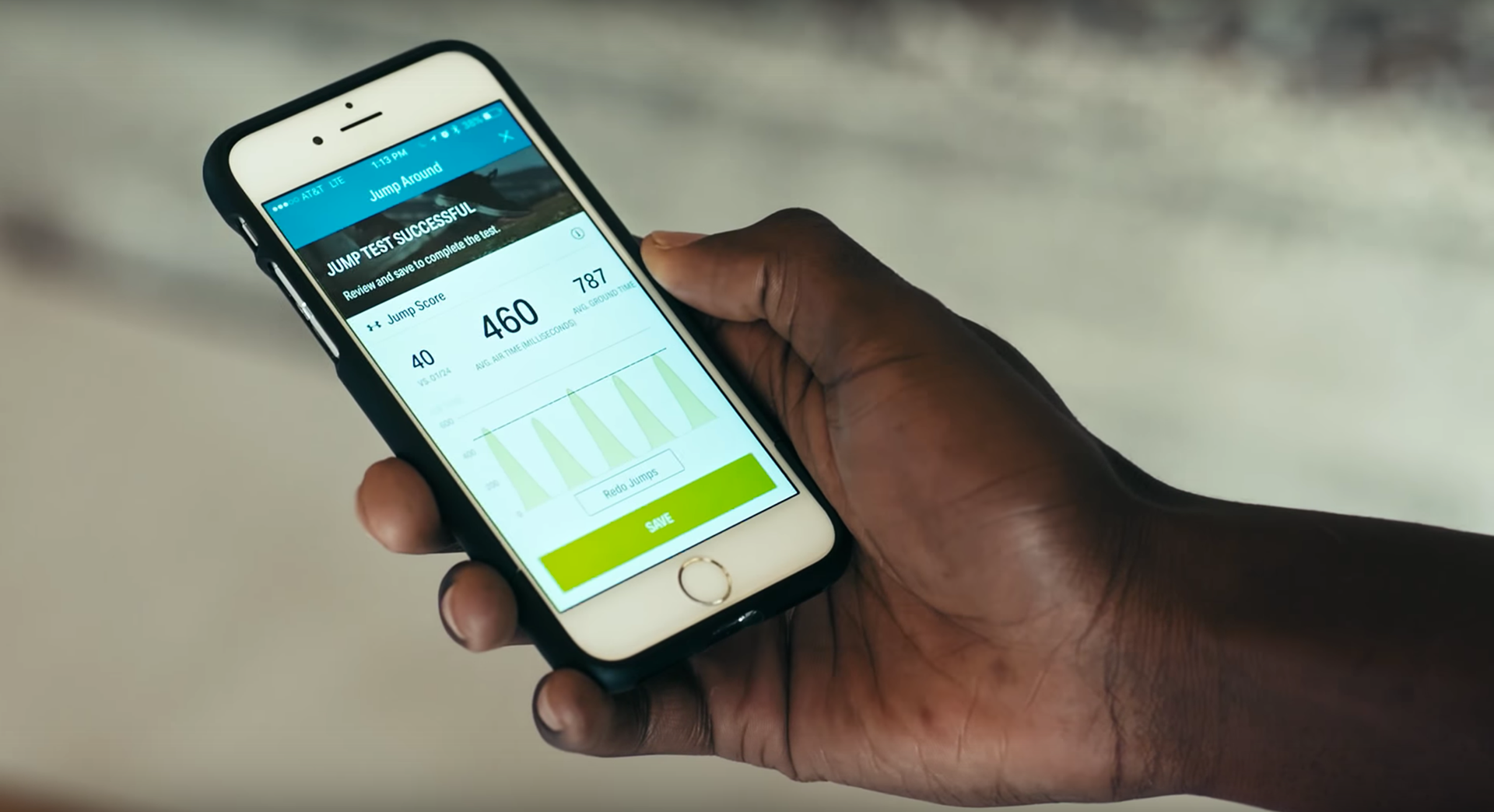
In the UX, I wanted to address improving the test feedback and make it clear to runners when they should take the test through a notification or prompt when loading the app. I worked with a copywriter and a dedicated sports scientist to translate ‘science-speak’ into more digestible terms that runners can understand. I also used their expertise to inform the graphic visualization of the test results.
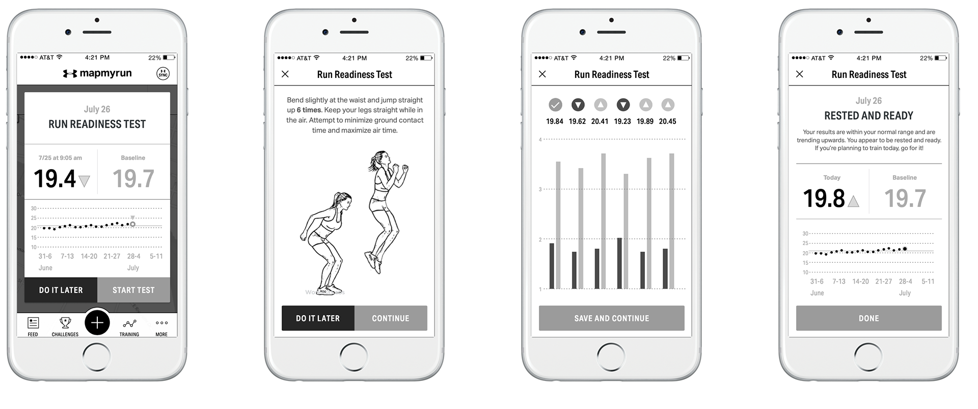
The visual elements in the initial demo design also needed work. Color was one of the ways we could provide the user with a glanceable indicator of their current state of fatigue. It seemed obvious after implementing it, but 'green light, yellow light, red light' was an easy way for our US-based audience to understand when to push and when to stop.

Shipped product
After more testing and multiple product reviews with the footwear team, marketing and executive leadership, we delivered the Jump Test in time for its debut at CES.


Project learnings and challenges
The biggest challenge of this project was mapping a business need to runner needs. The project was proposed and approved before asking real runners if they’d be interested in measuring fatigue, so it wasn’t a surprise in testing when runners shared skepticism that this test would be of value to them in the near term.
Another challenge of this program was guiding the user through the baselining exercise before taking their first test that provided feedback/actionable results. This is a huge barrier to entry for runners and requires diligence to do the test regularly for the most accurate results.